Poster Design
Branding and Identity
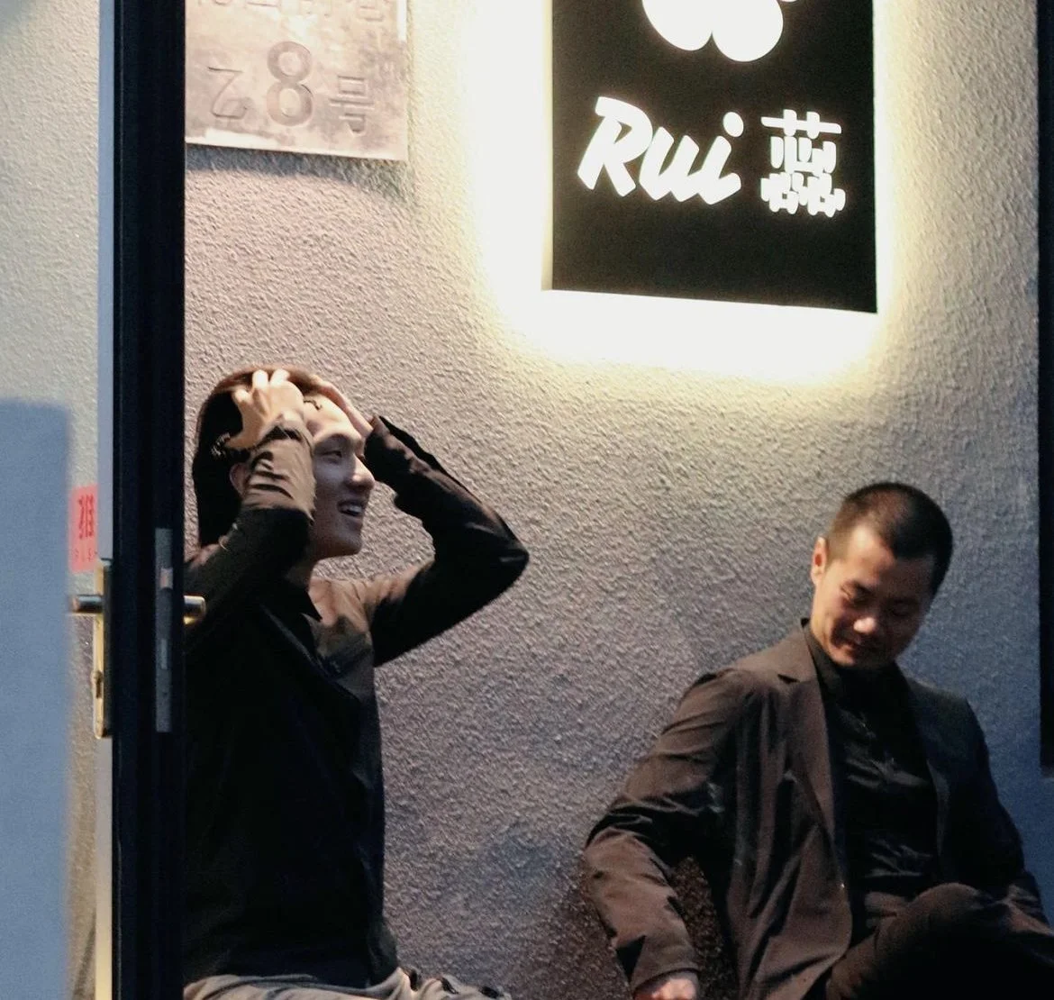
I. RUI BEER BAR
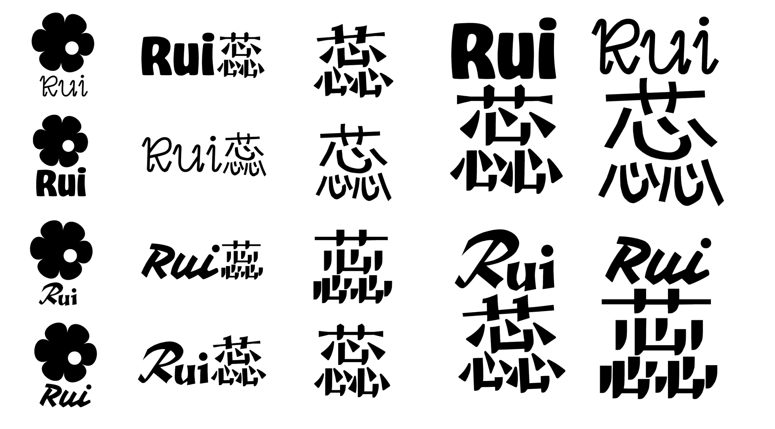
Rui is a beer restaurant in Beijing for which I developed the visual identity and branding. The owner envisioned a brand that felt approachable and welcoming while clearly communicating its identity as a beer house. After rounds of iteration, I selected typography inspired by classic Japanese beer packaging to evoke a sense of authenticity and craftsmanship. I designed a rounded, friendly logo mark, reflecting the meaning of "Rui" in Chinese—young flower. Complementing these elements, a soft color palette was chosen to enhance the brand’s warmth and accessibility, creating a cohesive identity that resonates with its clients and audiences.
The logo for Rui consists of three components: an English logotype, a Chinese character logotype, and a flower-shaped logomark. These elements are designed to be versatile, allowing the restaurant to use them individually or combine them in various compositions to suit different functions and contexts. This flexible approach ensures the branding remains cohesive while adapting seamlessly to diverse applications, from signage to packaging and digital platforms.
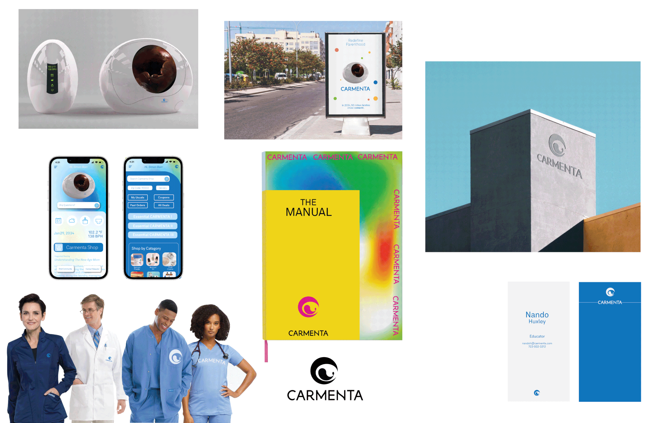
II. CARMENTA HEALTH

Carmenta is a medical company specializing in thermal management products for newborn infants, addressing a critical need in neonatal care. I was responsible for designing its visual identity and speculative branding during the startup funding phase, ensuring the brand effectively communicated both care and technological innovation. The challenge was to balance a sense of warmth and empathy—essential for a brand focused on infant health—with the precision and reliability expected of advanced medical technology. The resulting identity embodies this duality, projecting trustworthiness and compassion to resonate with both investors and the healthcare community.
The Carmenta logo is composed of two elements: a logo mark and a logotype. The logotype, rendered in a contemporary sans-serif font, features subtly curved lines that add softness and approachability, creating a friendly and welcoming impression. The logo mark, inspired by the shape of an infant cradled in a safe space, symbolizes protection and care. Additionally, the mark’s design resembles an eye, representing carefulness, attention, and nurturing—qualities integral to the brand's mission. Together, these elements convey a harmonious balance of empathy and advanced technology, aligning seamlessly with Carmenta’s focus on neonatal health.
This video was created for Insomniac, the biggest global rave company, and its fashion division, leveraging the brand’s archival materials to craft an immersive and dynamic experience. Using Cinema 4D, I brought their archive footage to life, capturing the vibrant energy of rave culture and the distinct aesthetic of their fashion line. Paired with music from the brand’s archive, the video delivers a cohesive and engaging sensory journey. Designed for versatility, the video has been used across social media platforms, the brand’s website, and various marketing campaigns, effectively connecting with audiences and amplifying Insomniac’s presence in both the fashion and rave communities.
MEDIA DESIGN
Other Print and Digital Design
-
![]()
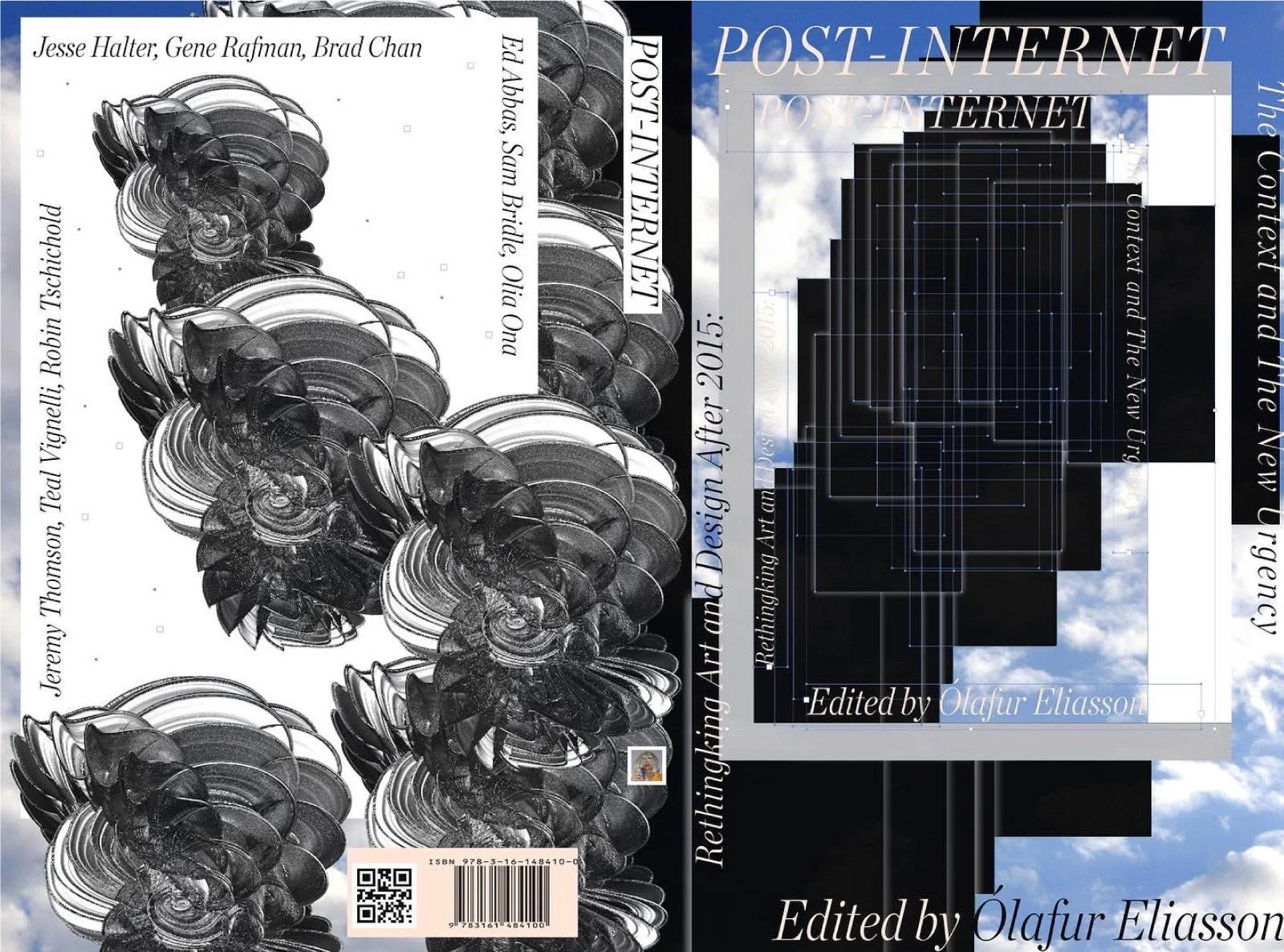
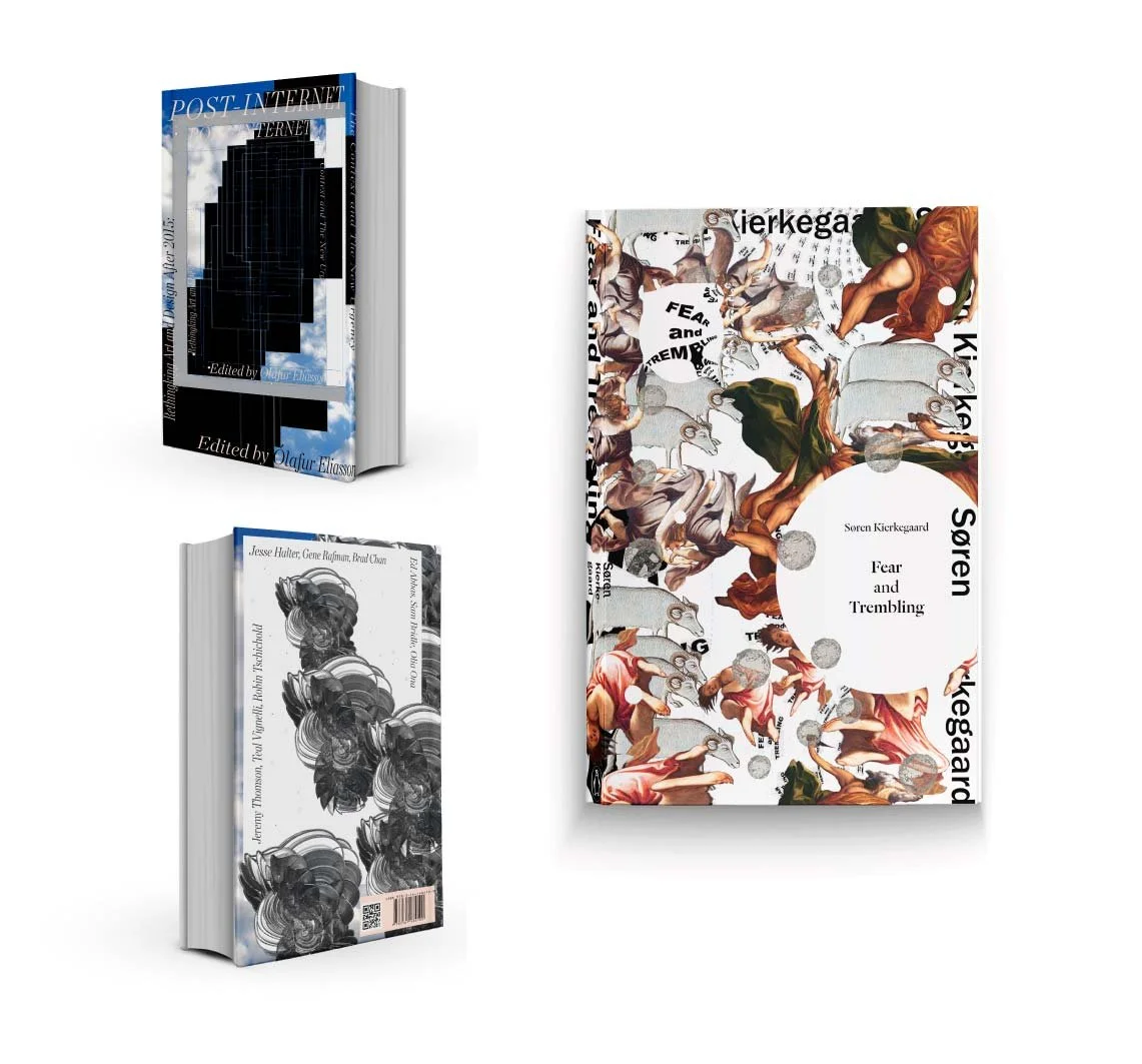
Book Cover
-
![]()
Fashion Branding
-
![]()
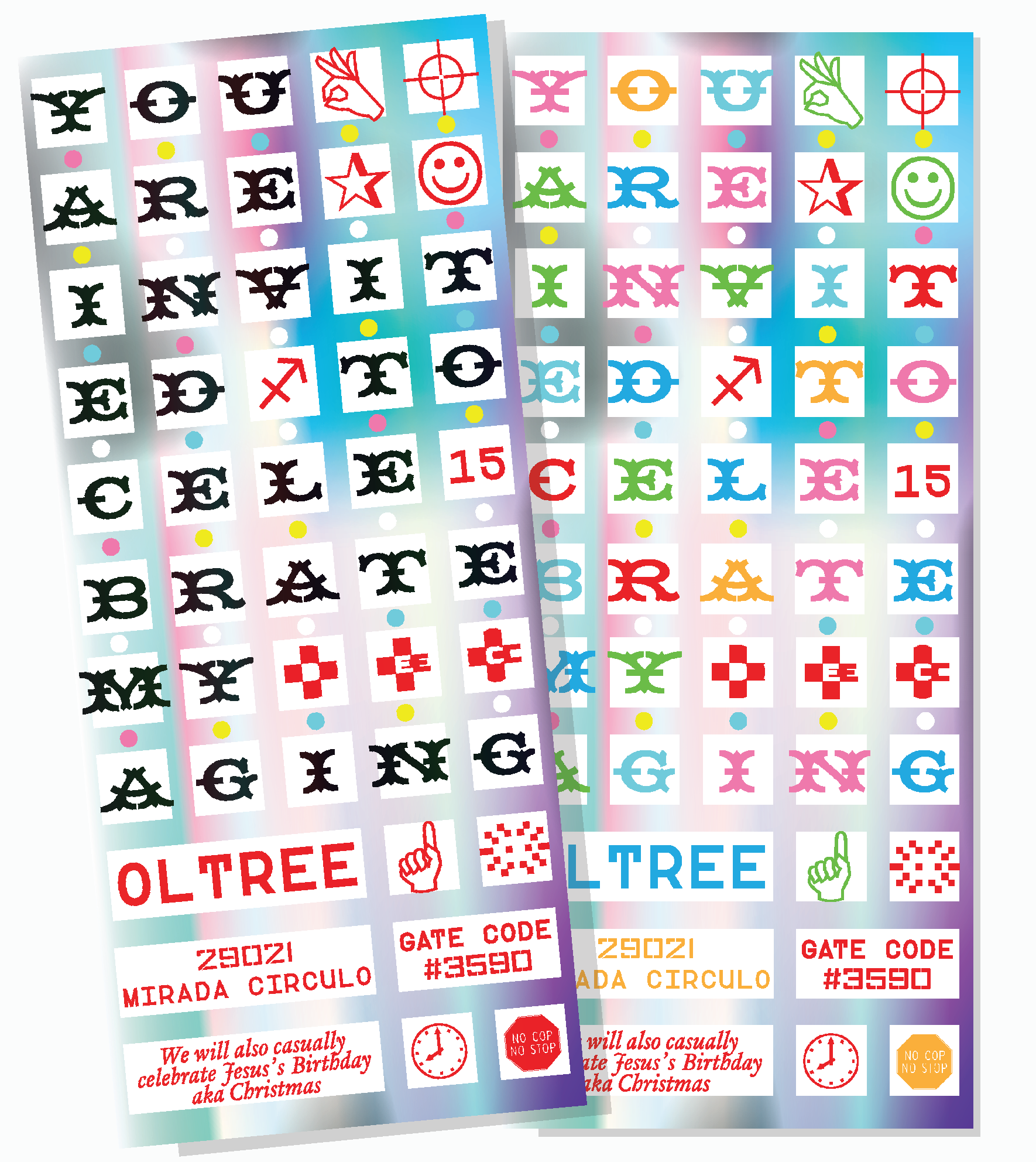
Invitations
-
![]()
Book Cover
-
![]()
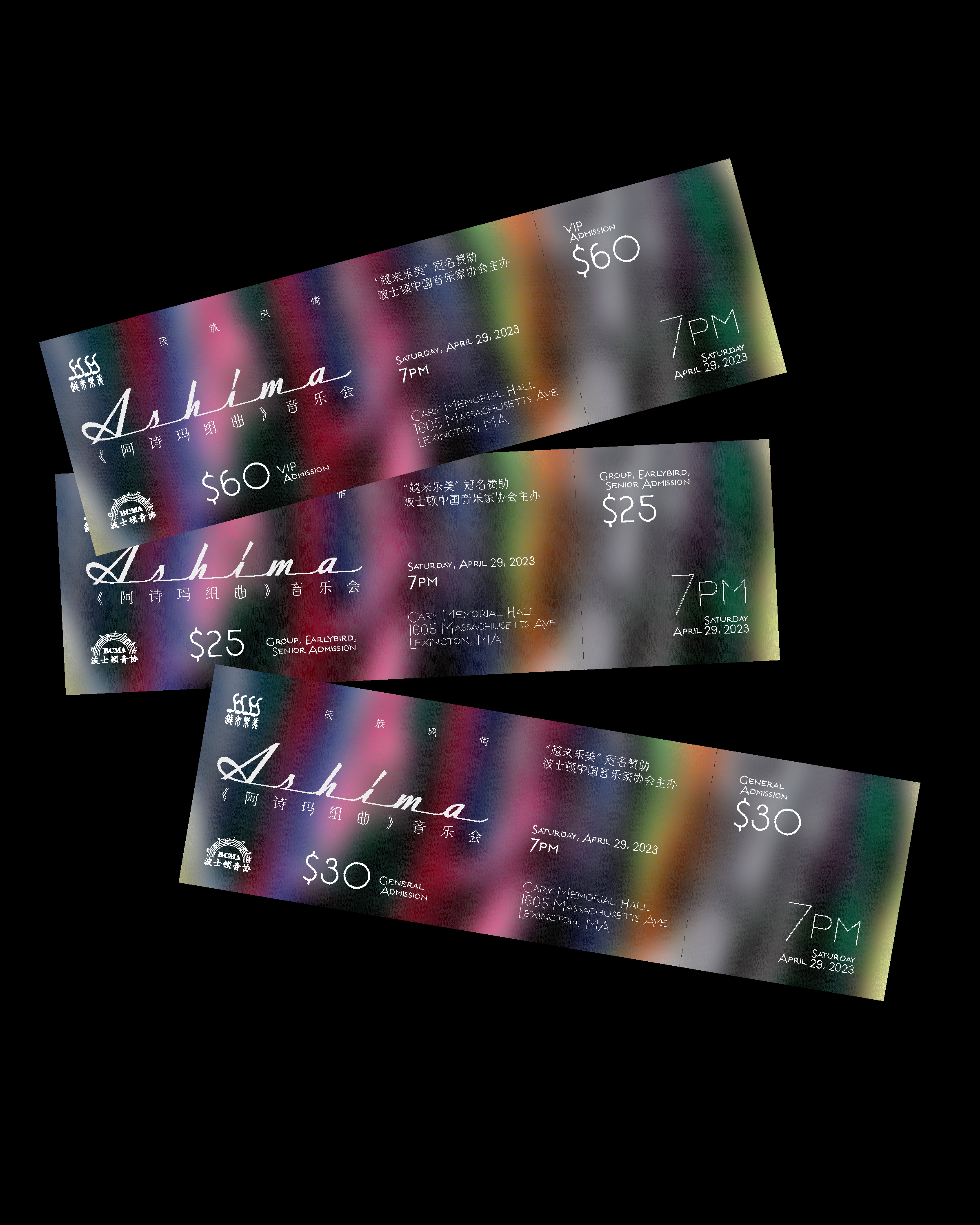
Event Tickets
-
![]()
Email Marketing
-
![]()
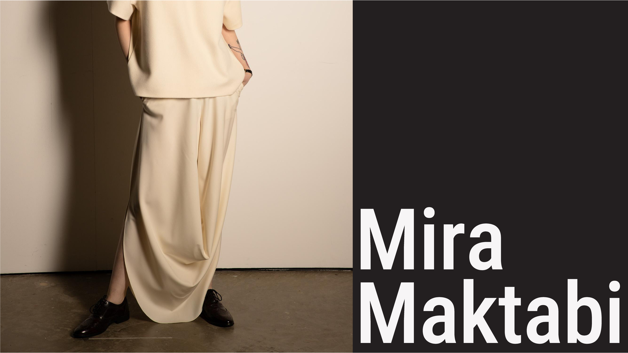
Fashion Branding
-
![]()
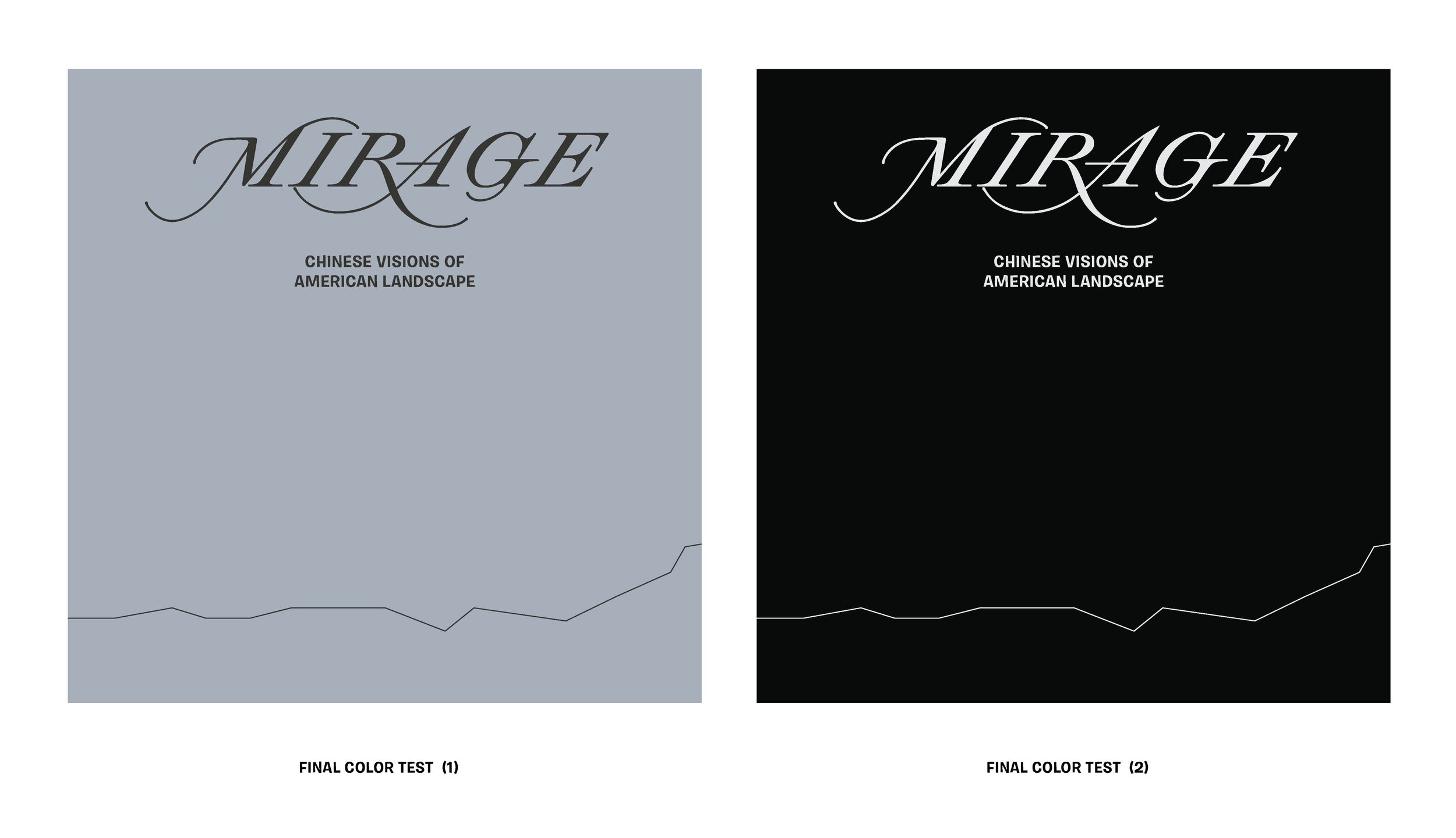
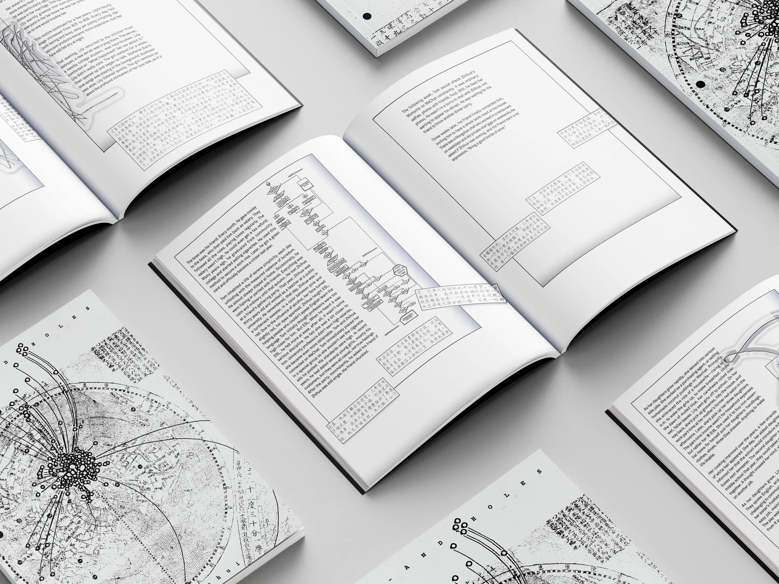
Book Design
-
![]()
Book Design
-
![]()
Event Invitation
-
![]()
Fashion Branding
-
![]()
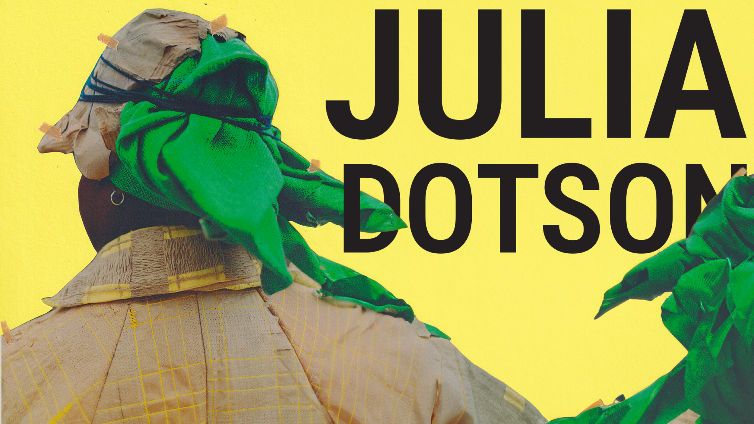
Book Design